
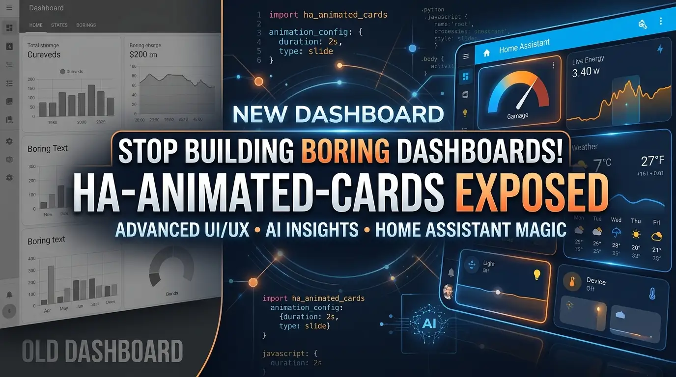
Stop Building Boring Dashboards! HA-Animated-Cards Exposed
Your Home Assistant dashboard is lifeless. Static icons. Dead cards. A sea of gray rectangles that tell you nothing at a glance. You've spent hours configuring entities, automations, and sensors—yet your dashboard looks like it was designed in 2003. Here's the brutal truth: if your smart home interface doesn't feel alive, you won't use it.
But what if every device could breathe? What if your fan spun, your heater flickered with flame, your washer rocked with motion? What if your dashboard didn't just display data—it performed it?
Enter HA-Animated-Cards. Created by the prolific smart home developer @Anasbox, this repository is exploding across the Home Assistant community for one simple reason: it transforms static Mushroom cards into dynamic, state-reactive animated masterpieces with pure CSS and Jinja2 templating. No custom components. No JavaScript↗ Bright Coding Blog hacks. Just copy-paste YAML that makes your dashboard impossible to ignore.
Ready to make your neighbors jealous? Let's dive deep.
What is HA-Animated-Cards?
HA-Animated-Cards is a curated collection of card-mod enhanced Mushroom card configurations for Home Assistant, designed and maintained by Anashost. Released as an open-source repository, it leverages the power of card-mod—Thomas Lovén's legendary CSS injection tool—to apply sophisticated CSS animations directly to Mushroom card elements.
The project's philosophy is elegantly simple: your dashboard should reflect reality. When your fan is spinning at high speed, the icon should blur with motion. When your smart plug draws serious power, it should pulse with energy. When your doorbell rings, it should shake with urgency. This isn't vanity—it's ambient information design.
What makes HA-Animated-Cards genuinely special is its dual-trigger architecture. Every card supports both state-based triggers (on/off, locked/unlocked) and numeric threshold triggers (power draw > 5W, temperature > 25°C). This means your animations respond to actual conditions, not just binary states. The repository has gained massive traction through five detailed YouTube tutorial batches, with the community contributing refinements and new card variants.
The project is organized into logical categories: Home (core collection), Appliances (washer, dryer, dishwasher), Battery (level and charging animations), Graph Cards (environmental data visualization), and Badge/Button makers. Each category contains production-ready YAML with extensive inline documentation.
Key Features That Make This Insane
State-Reactive Animation Engine. Every card uses Jinja2 templating to evaluate entity states in real-time. The animation CSS variables are conditionally applied based on whether your device is active, idle, or in transition. This isn't pre-baked GIF playback—it's live computational styling.
Dual-Mode Trigger System. Choose between use_number: true (numeric threshold mode) or use_number: false (simple state mode). The numeric mode supports full comparison operators: >, <, =, >=, <=. Monitor power consumption, temperature, humidity, or any numeric sensor to drive animations.
Dynamic Speed Scaling. Advanced cards like the Charger and Fan calculate animation duration from entity attributes. Higher power draw? Faster pulse. Higher fan percentage? Blurrier spin. The dur = 1.6 - (p / 800) formula in the Charger card is a masterclass in data-driven animation timing.
Multi-Layer Pseudo-Element Effects. The most sophisticated cards use ::before and ::after pseudo-elements with mix-blend-mode: screen to create depth. The Fan Ultra card generates warp rings and air stream shadows simultaneously. The Heater card layers core flame, outer glow, and ember pulse effects.
Color System Integration. All animations respect Home Assistant's RGB color variables (--rgb-{{ config.icon_color }} or custom --fan-color-rgb). Change your theme? The animations adapt automatically. The LED Strip card even runs a full hue-rotation cycle through the color wheel.
Sections View Compatibility. The repository includes explicit grid_options configuration for Home Assistant's modern Sections layout, solving the compression issues that plague many custom cards.
Light Mode Support. Built-in CSS variables for --card-primary-color and --card-secondary-color with background override instructions ensure your animations look stunning in both dark and light themes.
Use Cases Where HA-Animated-Cards Absolutely Dominates
1. Energy Monitoring Dashboards
Track which devices are actually consuming power. Your Smart Plug card pulses with a "ring-breathe" animation when active, but switch to numeric mode and it only triggers when power draw exceeds your threshold. Instantly spot energy vampires without reading numbers.
2. Climate Control Interfaces
The Heater card doesn't just show "heat" mode—it flickers with layered flame animations using hue-rotate color shifting. The Fan cards spin at speed-matched rates with motion blur. Your HVAC dashboard becomes tactile and intuitive.
3. Security & Access Systems
The Lock card distinguishes between locked (secure wobble), unlocking/locking (rapid action shake), and unlocked (gentle sway) states. The Doorbell card emits expanding ring shockwaves when triggered. Ambient awareness without alerts.
4. Appliance Status Boards
Washing machines rock and rotate during cycles. Sprinklers spray particle effects upward. Projectors emit light beams with radial gradients. Know your home's operational state from across the room, without reading a single label.
5. Entertainment & Ambient Lighting
The LED Strip card cycles through hue-rotate animations when on, breathing gently when off. The Projector card simulates lens focus glow and light beam projection. Your media room dashboard becomes thematic and immersive.
Step-by-Step Installation & Setup Guide
Prerequisites
Before installing HA-Animated-Cards, ensure you have:
- Home Assistant (Core, Container, OS, or Supervised)
- HACS installed for frontend component management
- Mushroom Cards installed via HACS
- card-mod installed via HACS or manually
Step 1: Install Dependencies
Navigate to HACS → Frontend → Explore & Download Repositories, then install:
# Search for and install these three components:
1. Mushroom          # by piitaya
2. card-mod          # by thomasloven
After installation, clear your browser cache and reload Home Assistant.
Step 2: Verify card-mod Functionality
Add a test card to verify card-mod is working:
type: entity
entity: sun.sun
card_mod:
  style: |
    ha-card {
      background: red !important;
    }
If the card background turns red, card-mod is active.
Step 3: Configure for Sections View (Critical)
If using the modern Sections dashboard layout, add this to any animated card that appears compressed:
grid_options:
  rows: 1.5
This expands the card's vertical space to accommodate the larger animated icon area.
Step 4: Light Mode Color Override (Optional)
For light theme users, add this to any card's ha-card style or your theme configuration:
background: '#1C1C1C' !important;
--card-primary-color: white !important;
--card-secondary-color: white !important;
Step 5: Deploy Your First Animated Card
Browse the HA-Animated-Cards repository, select a card from the appropriate category, copy the YAML, and paste it into your dashboard's Manual Card configuration. Replace entity IDs with your actual devices.
REAL Code Examples from the Repository
Example 1: Smart Plug with Ring-Breathe Animation
This is the simplest entry point into HA-Animated-Cards. The Smart Plug card demonstrates the core pattern: state evaluation → conditional CSS variable assignment → keyframe animation.
type: custom:mushroom-entity-card
entity: switch.plug_6_local
tap_action:
   action: toggle
icon: mdi:power-plug
icon_color: green
name: Smart Plug
card_mod:
	  style:
	    mushroom-shape-icon$: |
	      .shape {
	        {# ========== USER CONFIG ========== #}
	        {# true = number mode, false = state mode #}
	        {% set use_number      = false %}

	        {# STATE MODE SETTINGS #}
	        {% set state_entity    = 'switch.plug_6_local' %}
	        {% set active_value    = 'on' %}

	        {# OPTIONAL: NUMBER MODE SETTINGS #}
	        {% set number_entity   = 'sensor.plug_power' %}

	        {# '>' '<' '=' '>=' '<=' #}
	        {% set number_operator = '>' %}

	        {% set threshold       = 0.0 %}
	        {# ========== END USER CONFIG ====== #}

	        {# ======== TRIGGER DECISION LOGIC ======== #}
	        {% if use_number %}
	          {% set num = states(number_entity) | float(0) %}

	          {# Evaluate numeric rule #}
	          {% if number_operator == '>' %}
	            {% set trigger_active = (num > threshold) %}
	          {% elif number_operator == '<' %}
	            {% set trigger_active = (num < threshold) %}
	          {% elif number_operator == '=' %}
	            {% set trigger_active = (num == threshold) %}
	          {% elif number_operator == '>=' %}
	            {% set trigger_active = (num >= threshold) %}
	          {% elif number_operator == '<=' %}
	            {% set trigger_active = (num <= threshold) %}
	          {% else %}
	            {% set trigger_active = false %}
	          {% endif %}

	        {% else %}
	          {# State mode #}
	          {% if states(state_entity) == active_value %}
	            {% set trigger_active = true %}
	          {% else %}
	            {% set trigger_active = false %}
	          {% endif %}
	        {% endif %}
	        {# =========== END TRIGGER LOGIC =========== #}

	        {% if trigger_active %}
	          --shape-animation: ring-breathe 1.8s ease-out infinite;
	          opacity: 1;
	        {% else %}
	          --shape-animation: none;
	          opacity: 0.7;
	        {% endif %}
	      }

	      @keyframes ring-breathe {
	        0%   { box-shadow: 0 0 0 0 rgba(var(--rgb-{{ config.icon_color }}), 0.9); }
	        70%  { box-shadow: 0 0 0 14px rgba(var(--rgb-{{ config.icon_color }}), 0.0); }
	        100% { box-shadow: 0 0 0 0 rgba(var(--rgb-{{ config.icon_color }}), 0.0); }
	      }
	    .: |
	      mushroom-shape-icon {
	        --icon-size: 65px;
	        display: flex;
	        margin: -18px 0 10px -20px !important;
	        padding-right: 10px;
	      }
	      ha-card {
	        clip-path: inset(0 0 0 0 round var(--ha-card-border-radius, 12px));
	      }
What's happening here? The Jinja2 template evaluates whether to use numeric or state-based triggering. When trigger_active is true, it assigns --shape-animation: ring-breathe, which creates an expanding ring shadow that fades to transparency—mimicking a breathing power indicator. The rgba(var(--rgb-{{ config.icon_color }}), 0.9) dynamically pulls the green color variable and animates its alpha channel.
Example 2: Advanced Fan with Speed-Responsive Animation
This Fan Ultra card showcases the repository's most sophisticated techniques: attribute-driven animation speed, multi-pseudo-element layering, and directional motion blur.
{# Fan speed still based on THIS card's entity percentage #}
{% set speed = state_attr(config.entity, 'percentage') | int(0) %}

{% if trigger_active %}
  {% if speed == 0 and is_state(config.entity, 'off') %}
    --shape-animation: fan-ultra-idle 3s ease-in-out infinite;
  {% else %}
    {% set dur = 1.2 - (speed / 120) %}
    --shape-animation: fan-ultra-spin {{ [0.25, dur] | max | round(2) }}s linear infinite;
  {% endif %}
  --fan-warp-animation: fan-warp 1.4s ease-in-out infinite;
  --fan-stream-animation: fan-stream 1.6s ease-in-out infinite;
  opacity: 1;
{% else %}
  --shape-animation: none;
  --fan-warp-animation: none;
  --fan-stream-animation: none;
  opacity: 0.7;
{% endif %}
The dur = 1.2 - (speed / 120) formula is mathematically elegant: at 100% speed, duration drops to ~0.37s for frantic spinning; at 1% speed, it approaches 1.19s for lazy rotation. The | max | round(2) filter ensures we never drop below 0.25s (preventing seizure-inducing flashes) and rounds to two decimal places for clean CSS.
The ::before pseudo-element generates expanding warp rings with box-shadow radius animation, while ::after with mix-blend-mode: screen creates horizontal air stream effects that suggest directional airflow. This is three simultaneous animation layers on a single icon.
Example 3: Heater with Multi-Layer Flame Simulation
The Heater card demonstrates color variable extraction and chaotic keyframe design for organic, non-repetitive motion.
{# ========= FLAME COLOR CONFIG ========= #}
{% set flame_color = 'deep-orange' %}   {# 'red', 'amber', 'orange', etc. #}
--flame-color-rgb: var(--rgb-{{ flame_color }});
{# ===================================== #}

/* Core flame motion: chaotic vertical flicker + heat ripple */
@keyframes flame-core {
  0%   { transform: translateY(0)    scale(1);     filter: brightness(1.1) hue-rotate(0deg); }
  12%  { transform: translateY(-2px) scale(1.05);  filter: brightness(1.4) hue-rotate(-10deg); }
  25%  { transform: translateY(1px)  scale(0.98);  filter: brightness(0.9) hue-rotate(8deg); }
  40%  { transform: translateY(-3px) scale(1.07);  filter: brightness(1.5) hue-rotate(-18deg); }
  55%  { transform: translateY(0)    scale(1.02);  filter: brightness(1.2) hue-rotate(10deg); }
  70%  { transform: translateY(-1px) scale(1.04);  filter: brightness(1.35) hue-rotate(-6deg); }
  85%  { transform: translateY(2px)  scale(0.97);  filter: brightness(0.95) hue-rotate(6deg); }
  100% { transform: translateY(0)    scale(1);     filter: brightness(1.1) hue-rotate(0deg); }
}
Notice the irregular keyframe distribution—no symmetrical 0%/50%/100% here. The 12%, 25%, 40%, 55%, 70%, 85% breakpoints create aperiodic flickering that reads as genuinely organic. The hue-rotate filter shifts the flame color through warm tones dynamically, while brightness pulses suggest varying heat intensity.
The ::before and ::after pseudo-elements with filter: blur(3px) generate outer flame glow and ember halo respectively, with the transform-origin: 50% 75% anchoring the flame at its base like real fire.
Advanced Usage & Best Practices
Custom Color Overrides. While cards default to config.icon_color, advanced cards like the Heater and Fan Ultra expose --flame-color-rgb and --fan-color-rgb variables. Override these with any Home Assistant color name: 'red', 'amber', 'purple', 'cyan', 'deep-orange'.
Numeric Threshold Tuning. For power-monitoring cards, calibrate thresholds to your device's standby draw. A smart plug with 0.8W standby should use threshold: 2.0 to avoid phantom animations. Use number_operator: '>=' for inclusive triggering.
Performance Optimization. Complex multi-pseudo-element cards (Fan Ultra, Heater, Sprinkler) consume more GPU compositing resources. For low-powered tablets used as wall panels, prefer simpler single-animation cards like Smart Plug or Doorbell. Test will-change: transform on problematic cards.
Animation State Debugging. Temporarily set opacity: 1 and remove animation: none fallbacks to force continuous animation during development. Use browser DevTools → Elements → Styles to inspect computed CSS variables in real-time.
Batch Deployment Strategy. The repository's YouTube tutorials are organized into five batches of increasing complexity. Master Batch 1 (basic state triggers) before attempting Batch 4-5 (multi-layer effects). Each batch builds conceptual foundations.
Comparison with Alternatives
| Feature | HA-Animated-Cards | Custom Button Card | Picture Elements | Native Mushroom |
|---|---|---|---|---|
| Installation | HACS + card-mod only | HACS install | Built-in | Built-in |
| Animation Type | CSS keyframes (60fps) | CSS/JS hybrid | CSS transitions only | None |
| State Reactivity | Native Jinja2 templating | Limited templating | Manual state conditions | None |
| Numeric Triggers | Full operator support | Basic threshold | Manual | None |
| Performance | GPU-composited | JS overhead | GPU-composited | Minimal |
| Customization Depth | Pseudo-element layers | Moderate | Single layer | None |
| Learning Curve | Medium (YAML + CSS) | Medium | High (positioning) | Low |
| Maintenance | Community templates | Single maintainer | Self-maintained | Official |
| Mobile Performance | Excellent | Good | Variable | Excellent |
Why HA-Animated-Cards wins: It occupies the sweet spot between zero-animation native cards and heavy custom components. No JavaScript execution means no memory leaks on always-on wall panels. The Jinja2 templating integrates natively with Home Assistant's state machine—no external APIs, no polling, no lag. And the pseudo-element architecture enables effects impossible with single-layer solutions.
FAQ
Q: Do I need to know CSS to use HA-Animated-Cards? A: No. The repository provides complete, documented YAML. You only need to change entity IDs and optional color names. CSS knowledge helps for custom modifications but isn't required for deployment.
Q: Will these animations drain my tablet's battery? A: CSS animations are GPU-accelerated and extremely efficient. They're far lighter than JavaScript-based alternatives. For maximum efficiency, use simpler cards (Smart Plug, Doorbell) on battery-powered displays.
Q: Can I use these with cards other than Mushroom?
A: Not directly. The selectors target Mushroom's shadow DOM structure (mushroom-shape-icon$). However, the CSS keyframe techniques can be adapted for other card types with appropriate selector modifications.
Q: Why aren't my animations showing in the visual editor? A: card-mod styles render at runtime, not in the editor preview. Save and exit the editor to see animations live. Use Preview Mode or a separate browser tab for testing.
Q: How do I fix compressed cards in Sections view?
A: Add grid_options: rows: 1.5 to your card configuration. This expands vertical space for the larger animated icon area.
Q: Can I mix numeric and state triggers on the same card?
A: The architecture supports one mode per card, but you can duplicate cards with different trigger configurations and use conditional: cards or state-switch: to show the appropriate one.
Q: Are these animations accessible for users with vestibular disorders?
A: Consider using prefers-reduced-motion media queries in your theme for accessibility. The repository doesn't currently include these, but you can wrap animations conditionally.
Conclusion
Your Home Assistant dashboard doesn't have to be a static spreadsheet of device states. With HA-Animated-Cards, every interaction becomes visually rewarding, every state change becomes instantly scannable, and your smart home finally feels as intelligent as it actually is.
The repository represents something rare in the Home Assistant ecosystem: production-ready artistry that doesn't sacrifice performance or stability. @Anasbox has built not just a collection of configs, but a design language for ambient information display. The dual-trigger system, dynamic speed scaling, and pseudo-element layering techniques are genuinely innovative approaches that push what's possible within Home Assistant's constraints.
My recommendation? Fork the repository, deploy the Smart Plug and Fan cards as your entry point, then progressively adopt more complex animations as your comfort grows. Watch the YouTube tutorial batches for visual guidance. And most importantly—share your creations back with the community.
Your dashboard is your home's face to the world. Make it unforgettable.
⭐ Star HA-Animated-Cards on GitHub | 🎥 Watch the Tutorials | ☕ Support @Anasbox